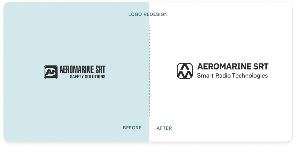
NEW LOGO
In autumn, the wind of change is especially strong. And some renewals also took place in our company!
Today we are excited to announce our new logo, which you will see on all our resources from now on. The company's slogan and corporate colors have also changed!
All these things were done to fully express what we feel today.
The redesigned logo symbolizes our commitment to traditions:
▶ TWO KEY LETTERS of the company’s name in a square with rounded corners mean permanence, balance, and at the same time flexibility.
Along with this, we would like to highlight other values that are a priority for us:
▶ The RHOMBUS, stretched vertically, implies development in two directions - aviation and maritime;
▶ A triangle is the most dynamic of geometric shapes, with powerful energy. There are THREE TRIANGLES in our logo and they are all pointing upwards, which symbolizes our tireless pursuit of development.
Dear friends, how do you find changes in the visual image of our brand? We'd love your feedback!
Be the first to comment